"Choosing the wrong color temperature can make your home look like a hospital or a dungeon. A comprehensive deep dive into Kelvin values, circadian science, and professional lighting standards."
Introduction: Understanding the Language of Light
Architecture is frozen music, and light is the rhythm that brings it to life. However, even the most beautifully designed spaces can fall flat if the "color" of the light is mismatched. This attribute is known as Color Temperature, measured in degrees Kelvin (K).
It is not about how hot the bulb gets, but rather the color hue emitted by a theoretical "black-body radiator" as it is heated. As the temperature rises, the glow shifts from warm red, to orange, to yellow, to white, and finally to blue-white.
For lighting professionals and interior designers, mastering the Kelvin scale is the first step in creating environments that are not only visible but felt.
The Spectrum Detailed: A Nuanced Breakdown
While most consumer packaging simplifies options into "Warm" and "Cool," the professional spectrum is far more nuanced. Here is the definitive breakdown:
1. 2700K: The "Warm Incandescent" Standard
- Visual Feel: Golden, cozy, intimate, traditional.
- Best For: Bedrooms, Living Rooms, High-end Restaurants, Hospitality Lounges.
- Why it works: It mimics the glow of traditional tungsten filament bulbs. It relaxes the eyes and skin tones appear healthy and warm. It is the default for "relaxing" environments.
2. 3000K: The "Soft White" Modern Standard
- Visual Feel: Clean, warm but crisp, inviting.
- Best For: Whole-home general lighting, Art Galleries, Hotels, Foyers.
- Why it works: This is the "Sweet Spot." It removes the heavy yellow tint of 2700K without becoming sterile. If you have modern furniture with white, grey, or cool tones, 3000K prevents them from looking muddy (which happens under 2700K).
3. 3500K: The "Neutral" Bridge
- Visual Feel: Balanced, neutral, energizing but not harsh.
- Best For: Retail stores, Open-plan offices, Public spaces.
- Why it works: Often overlooked in residential settings, 3500K is the king of commercial retail. It renders colors accurately without the "sleepy" feel of 3000K or the "sterile" feel of 4000K.
4. 4000K: The "Cool White" Functional Standard
- Visual Feel: Alert, clean, clinical, energetic.
- Best For: Kitchens, Bathrooms, Garages, Offices, Schools, Grocery Stores.
- Why it works: This light mimics morning sunlight. It provides excellent contrast, making it ideal for task-oriented spaces where focus is required. It makes chrome faucets sparkle and white countertops look pure white.
5. 5000K+: The "Daylight" Warning
- Visual Feel: Blue-white, intense, harsh.
- Best For: Industrial warehouses, Hospitals, Specialized detailed work (jewelry), Basements with no windows.
- Why to avoid it: In a residential setting, 5000K often appears unnatural and "hospital-like" at night. It contains a high spike of blue light, which can affect sleep cycles. Use with extreme caution.
The Science: Light and Human Physiology
Lighting is not just visual; it is biological. Our bodies are governed by the Circadian Rhythm, a 24-hour internal clock regulated primarily by light reception.
- Warm Light (2700K - 3000K): Simulates sunrise and sunset. It has low blue light content, signaling the brain to produce Melatonin, the sleep hormone. This is why warm light feels relaxing.
- Cool Light (4000K - 6000K): Simulates mid-day sun. It suppresses Melatonin and stimulates the production of Cortisol, the stress/alertness hormone. This boosts concentration and wakefulness.
Design Implication: Installing 4000K or 5000K lights in a bedroom is biologically counterintuitive. It essentially tells your brain "it's noon, stay awake," potentially disrupting sleep quality.
Room-by-Room Strategy Guide
To achieve a professional lighting plan, follow this hierarchy:
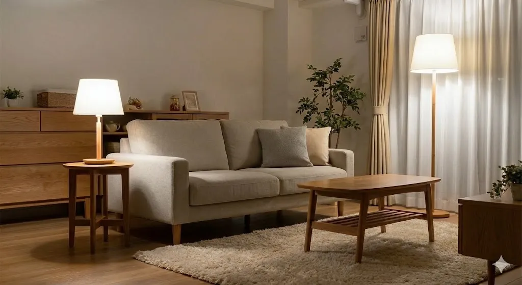
1. The Living Room (Relaxation Core)
Recommendation: 2700K or 3000K.
Strategy: Layer your lighting. Use 3000K for recessed cans (general lighting) to keep the room feeling modern. Use 2700K for table lamps and floor lamps to create a warmer, cozier atmosphere in the evening.
2. The Kitchen (Task Core)
Recommendation: 3000K or 4000K.
Strategy: If your kitchen is open-concept, stick to 3000K to match the living room. If it's separate, 4000K is superior for reading recipes and seeing perception of food freshness. Pro Tip: Use 4000K under-cabinet lights for tasks and 3000K overheads.
3. The Bathroom (Vanity)
Recommendation: 3000K to 4000K.
Critical Note: For applying makeup, 4000K (Neutral White) is the most honest light. 2700K is too forgiving; you might over-apply bronzer because the warm light hides it. Linear sconces on both sides of the mirror are best.
4. The Master Bedroom (Sanctuary)
Recommendation: 2700K.
Strategy: This room has one purpose: rest. Avoid cool temperatures entirely. Bedside reading lights should be strictly 2700K.
Pro Tips: Beyond the Kelvin Score
1. Don't Mix Temperatures
This is the cardinal sin of lighting. Having a cooler 4000K bulb next to a warm 2700K bulb creates "visual noise." Pick a primary temperature (usually 3000K for whole-home) and stick to it for all permanent fixtures.
2. CRI Matters (Color Rendering Index)
Two bulbs can both be 3000K, but one makes your skin look green/grey, and the other makes it look vibrant. Always check the box for CRI 90+. It ensures that the objects in your room appear true to life.
3. Dimming Changes Everything (Dim-to-Warm)
Traditional LEDs maintain the same color when dimmed. The newest luxury technology is "Dim-to-Warm." As you dim these LEDs, they shift from 3000K down to 2200K or 1800K (candlelight), perfectly mimicking the behavior of natural fire or halogen bulbs.
Conclusion
Lighting is the fourth dimension of architecture. By consciously selecting your Color Temperature, you are not just buying a light bulb; you are defining the mood, functionality, and biological impact of your space.
For a modern, high-end residence, the safest and most versatile choice is 3000K with high CRI (90+). It strikes the perfect balance between the warmth of home and the clarity of modern design.
Commercial Pathways